http://prezi.com/vv1e9hxmxzoj/media-coursework-evaluation/
Search This Blog
Tuesday, 24 April 2012
Sunday, 15 April 2012
Double page spread (Final)
Here it is, the final edition of my double page spread. Despite the fact that my plan and my final version of my double page are completely different , I'm actually quite happy with this layout and color scheme! As you can see, I've consistently used the same background on my Front cover, Contents page and double page spread which shows consistency. Similarly, I've used the title 'BEATZ' on two of the pages in the top right corner ( contents page and double page) which again shows consistency. In addition, I also added small printed writing to my contents page and double page spread saying where the picture was taken and by who (bottom left corner) this gives it a bit more realistic look. My primary idea was to put one picture of the artistt with a bandanna on his face on the left page of the double page spread and all the text on the right side of the page.
Front cover (Final)
This is my final front cover. As you can see it looks much better compared to my preliminary task. I collected some feedback by showing this to my friend's and all of them said that I looks good and professional. On my original plan I was to put the barcode in the right bottom corner, but when I looked at other magazine, nearly all of them had their barcodes in the lift bottom corner.
Monday, 12 March 2012
Progression (Front Cover)

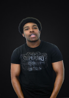
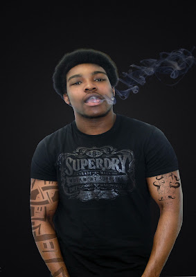
This the picture i chose for my front cover. I made him pose like that because I wanted to photoshop smoke coming out of his mouth. The reason why I made him a wear a t-shirt was because I also wanted to photoshop tattoos on his arms, which appeals more to a HIP HOP magazines. I got the idea from looking at other Hip Hop magazines. On almost every front cover there is a male artist with tattoos on his upper body.
 Here i have cropped out the artist and added a black/grey background which matches the T-shirt he is wearing. I also made his arms bigger and air-brushed his face.
 As you can see I photoshoped smoke onto the picture. I took a picture of a friend smoking and cropped out the smoke which was time consuming.

This is the final modification to the picture itself where I photoshoped tattoos onto his arms. I found some pictures of tattoos and cropped them out using the lasso tool and then finally faded the tattoos so they look real.
Friday, 2 March 2012
Name for my magazine
I have decided to call my Hip Hop magazine " BEATZ". It is a very unique magazine name which tells the audience without even opening the magazine that it is a Hip Hop/Rap magazine. Furthermore, almost every rapper raps about the streets which is why i chose that font because it has a city at the bottom of the writing, this is why i chose BEATZ as my magazine name. The term BEAT encompasses all aspects of hip hop music, it's most commonly used to refer to the instrumental of hip hop music. It shows the connection between the streets and Hip hop music. In addition, it is a catchy name and easy to remember.
Saturday, 18 February 2012
Shot List
For the front cover I haven't decided yet, I might use a mid-shot or a close up of a male model. The background is going to be dark becasue of my colour scheme.I will use Photoshop to manipulate the background. I will also add a drop shadow to model so it looks more realistic.
For my contents page I will use a mid shot of crouching male model to create the "I am Hard" effect. He's going to wear jeans with white trainers and a red jacket. Again i will use Photoshop to manipulate the picture.
For my double page spread I will use again a mid shot of a male model posing whit a bandanna wrapped around his face. He's also going to wear a tank top where you can see his arms, this will create the "don't mess with me " look. I am going to use Photoshop to make his arms look bigger.
Scamp
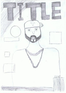
For my front cover, i'm going to use a mid-shot of a male artists. The model is going to look straight at the camera, this is called angle of gaze. I also have decided to put the title in the centre(top) of the page because when doing my research i noticed that almost every title is at the top of the page. The title is always bigger than the rest of the text on the magazine. I'm also going to put the bar code in the right bottom corner.
 For my contents page i'm going to use a mid shot of my model crouching, which shows that he is the one in control. The text is going to be on the right side in colums.
 For my double page spread, I'm also going to use a mid-shot or a close-up of the model looking straight at the camera, so the audience knows that he's talking to them, when reading the article/interview. Half of the picture is going to take up half the page and the text the other half.
Results of my my survey questions handed out to students
I handed out 20 survey questionnaires which have been filled out and given back to me so i can complete my research.
These are some of the results:
What sort of genre do you listen to?
As you can see the majority ticked Hip Hop which i expected because Hip Hop is a popular genre.
How much do you normally spend on a Music Magazine?
Music Magazines are much more expensive than ordinary magazines. The results are showing that the majority of the people asked ticked £4 and £5. I thought about it and decided to price my magazine for £4.50, it is affordable. Compared to other magazines, my magazine is a lot cheaper which is a good marketing strategy. I've looked at other magazines and they sell theirs for around £5.50. So i think £4.50 is a great price.
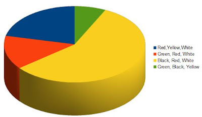
What colour scheme attracts you the most?
By looking at other Hip Hop magazines i chose these colours. The majority of the people asked ticked the Black Red and White box. Before i even handed out the survey i knew people would be attracted to most by those colours. These results are just confirming that, i took the right decision choosing this colour scheme.
Friday, 10 February 2012
Reader Profile
Lucas is a 16-year old mixed-race college student that lives in Croydon with his mother and two younger sisters. In college, he studies Media Studies, Business Studies, and Music, he is generally a very smart and well behaved student, and passed 9 GCSE's. After school and on the weekends, Lucas hangs out with his friends usually at each other’s houses; they usually play video games and listen to hip hop music. His favourite type of sport is football and he is a dedicated fan to Man Utd, he enjoys playing football with his friends along with basketball. His favourite type of music is Hip-hop and Rap, with his favourite artists being Drake and Lil Wayne, both of whom he has seen live in concert. He first started listening to hip-hop music at the age of 10 after his older cousin was listening to it and he was interested in the music. The music then helped him escape problems at home during his parent’s separation and also helps him to concentrate when he has work to do or exams to study for. For Lucas, music is more than just something to say you listen to impress other people; it is a way of expressing his feelings. He usually buys his clothes from shops like H&M and Top man, wearing usually jeans and shirts, appearance is very important to him. My music magazine will appeal to Lucas as it will be a Hip Hop magazine with the Top 5 newcomer stars of Hip Hop.
Monday, 6 February 2012
Wednesday, 1 February 2012
Use of semiotics in XXL
I am going to deconstruct XXL magazine for my new set work, with the use of semiotics and polysemic images and signs. Immediately the red piece of writing which says” Return of the real G”, attracts the readers eye. The word “real G” relates to Young Jeezy because before he became a rapper he was a gangster. It also means that he is not just talking about Drugs and killing, he’s actually been there. The picture itself says it all; Young Jeezy is stereotypically dressed like a gangster with the tank top and the two chains with two AK-47’s on it. The two guns on his chains again relate to the text “Return of the real G”.
In the top right corner the text “The real street Issue” connects to the other teasers underneath, it represents the beef between the rappers, and how some of them had real fights instead of diss tracks, that’s why it says the real street issue because its more than just dissing each other on their tracks.
In the top right corner the text “The real street Issue” connects to the other teasers underneath, it represents the beef between the rappers, and how some of them had real fights instead of diss tracks, that’s why it says the real street issue because its more than just dissing each other on their tracks.
Without the text on the magazine the audience would know what the magazine is about because Young Jeezy on the picture looks aggressive and Ghetto, he looks like he’s looking for trouble.
Sunday, 29 January 2012
State five music magazine titles and discuss what their names signals in relation to the magazine
XXL
'XXL' is short for 'Extra extra large’; implying the huge amount of content within the magazine, therefore the reader would be kept entertained and interested and may want to purchase the next magazine released.
Respect
Respect is means authority and dominance. In relation to the magazine, the title 'Respect' suggests that the reader may gain respect from the featured artists in the magazine.
Vibe
Vibe is short for vibration. This name suggests a new 'vibe' to the genre of Hip Hop and RnB where the audience can relate to the music whilst feeling this 'vibe'.
Flavour
This magazine focuses on RnB. The title suggests a new flavour towards RnB, which can attract an audience who are interested in this genre. The word 'Flavour' is generally associated with somebody’s preference or as some may say, 'taste'; therefore the magazine could be targeted at people who prefer to listen RnB as opposed to other genres.
This magazine focuses on RnB. The title suggests a new flavour towards RnB, which can attract an audience who are interested in this genre. The word 'Flavour' is generally associated with somebody’s preference or as some may say, 'taste'; therefore the magazine could be targeted at people who prefer to listen RnB as opposed to other genres.
The Source
This title suggests a source which informs the reader and they can gather information from it. Therefore, considering the title name, 'The Source' may be a magazine of which the reader is informed about new artist's and what is current in the music industry.
This title suggests a source which informs the reader and they can gather information from it. Therefore, considering the title name, 'The Source' may be a magazine of which the reader is informed about new artist's and what is current in the music industry.
Thursday, 26 January 2012
Wednesday, 25 January 2012
Saturday, 21 January 2012
Our final task
Today we have been given out last and final task, the task is to make a professional looking music magazine. We will have to take our own pictures and edit them using softwares like photoshop.
Friday, 20 January 2012
Preliminary task
This is my final front cover for the preliminary task. As you can see i used a dark gradient for the background and a mid-shot of the model for my magazine.
On my contents page i used 4 different pictures of student's revising or playing football. For page 10 which is called "The next big step..." i used a picture of a male student looking up which interacts with the text. He is looking up because this shows that he is thinking about the next step (future).
Subscribe to:
Comments (Atom)


