http://prezi.com/vv1e9hxmxzoj/media-coursework-evaluation/
Talhaa's Media Blog
Search This Blog
Tuesday, 24 April 2012
Sunday, 15 April 2012
Double page spread (Final)
Here it is, the final edition of my double page spread. Despite the fact that my plan and my final version of my double page are completely different , I'm actually quite happy with this layout and color scheme! As you can see, I've consistently used the same background on my Front cover, Contents page and double page spread which shows consistency. Similarly, I've used the title 'BEATZ' on two of the pages in the top right corner ( contents page and double page) which again shows consistency. In addition, I also added small printed writing to my contents page and double page spread saying where the picture was taken and by who (bottom left corner) this gives it a bit more realistic look. My primary idea was to put one picture of the artistt with a bandanna on his face on the left page of the double page spread and all the text on the right side of the page.
Front cover (Final)
This is my final front cover. As you can see it looks much better compared to my preliminary task. I collected some feedback by showing this to my friend's and all of them said that I looks good and professional. On my original plan I was to put the barcode in the right bottom corner, but when I looked at other magazine, nearly all of them had their barcodes in the lift bottom corner.
Monday, 12 March 2012
Progression (Front Cover)

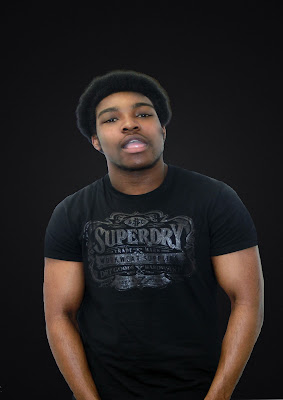
This the picture i chose for my front cover. I made him pose like that because I wanted to photoshop smoke coming out of his mouth. The reason why I made him a wear a t-shirt was because I also wanted to photoshop tattoos on his arms, which appeals more to a HIP HOP magazines. I got the idea from looking at other Hip Hop magazines. On almost every front cover there is a male artist with tattoos on his upper body.
 Here i have cropped out the artist and added a black/grey background which matches the T-shirt he is wearing. I also made his arms bigger and air-brushed his face.
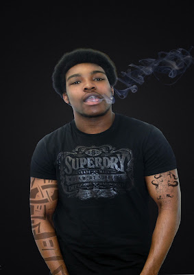
 As you can see I photoshoped smoke onto the picture. I took a picture of a friend smoking and cropped out the smoke which was time consuming.

This is the final modification to the picture itself where I photoshoped tattoos onto his arms. I found some pictures of tattoos and cropped them out using the lasso tool and then finally faded the tattoos so they look real.
Friday, 2 March 2012
Name for my magazine
I have decided to call my Hip Hop magazine " BEATZ". It is a very unique magazine name which tells the audience without even opening the magazine that it is a Hip Hop/Rap magazine. Furthermore, almost every rapper raps about the streets which is why i chose that font because it has a city at the bottom of the writing, this is why i chose BEATZ as my magazine name. The term BEAT encompasses all aspects of hip hop music, it's most commonly used to refer to the instrumental of hip hop music. It shows the connection between the streets and Hip hop music. In addition, it is a catchy name and easy to remember.
Saturday, 18 February 2012
Shot List
For the front cover I haven't decided yet, I might use a mid-shot or a close up of a male model. The background is going to be dark becasue of my colour scheme.I will use Photoshop to manipulate the background. I will also add a drop shadow to model so it looks more realistic.
For my contents page I will use a mid shot of crouching male model to create the "I am Hard" effect. He's going to wear jeans with white trainers and a red jacket. Again i will use Photoshop to manipulate the picture.
For my double page spread I will use again a mid shot of a male model posing whit a bandanna wrapped around his face. He's also going to wear a tank top where you can see his arms, this will create the "don't mess with me " look. I am going to use Photoshop to make his arms look bigger.
Subscribe to:
Comments (Atom)


